Some recent searching for “Hugh Morton” on newspapers.com led to a book review titled “Look Looks at The South in Pictures” by Bob Sain in the 19 October 1947 issue of The Daily Tar Heel. The very last paragraph parenthetically reads:
(Incidentally, North Carolina came off badly in space allotment; tobacco process shots took most of our space while Chapel Hill was ignored. There was one picture of the Duke campus. However, we recognized one photograph by Carolina man Hugh Morton: a misty Smoky Mountain shot.)
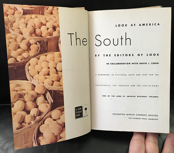
Of course I needed to know which Hugh Morton photograph, so I looked for the book in the University Libraries catalog. Surprisingly UNC does not hold that book, so I submitted an interlibrary loan request and it arrived late last week. Titled The South, the book is part of a series with nine volumes titled “Look at America” that was compiled by editors from the magazine Look with each book “written in collaboration with” various authors. David L. Cohn is the author for The South. [UNC does, after all, have the book; see the clarification below, which I added after I published this post.]
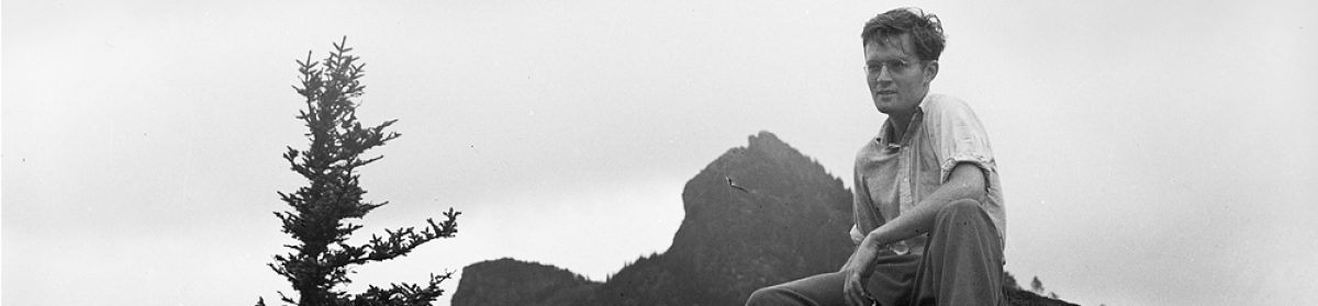
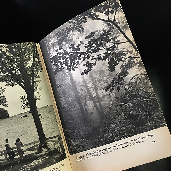
The photograph above shows Hugh Morton’s photograph on page 81. I immediately recognized it because I seriously considered printing a scan made from the negative for inclusion in the Hugh Morton retrospective exhibition (currently at the North Carolina Museum of History). As much as I liked the image, it just didn’t quite fit in with the rest of the exhibition.
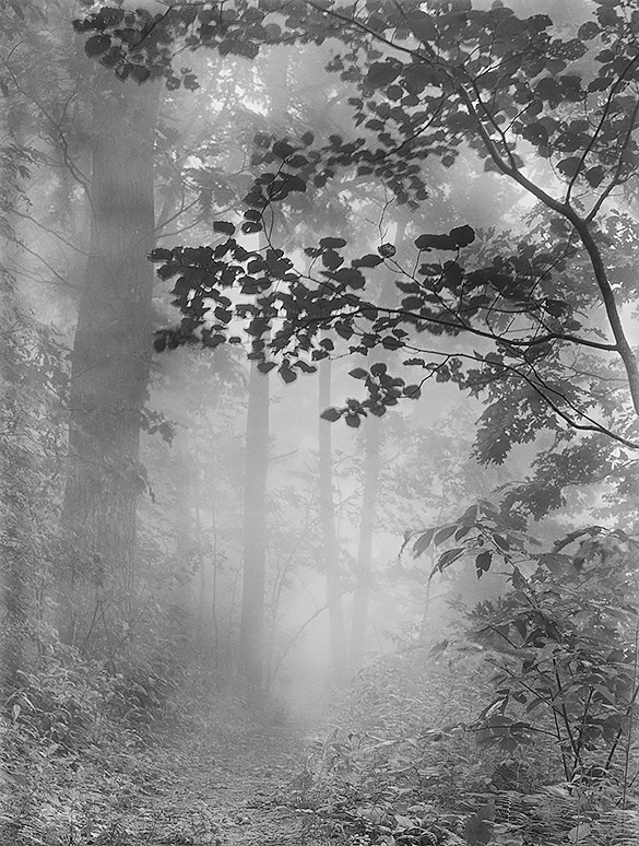
Upon closer inspection, the photograph in the book does not seem to be the exact same image as the negative. You can see in the scan above that many of the leafs are moving. Morton may have made an additional negative at that location, but there’s not another similar negative in the collection, at least that I could find.
The comparison between the printed page in the book and the negative scan is a good example of two challenges we faced when printing the exhibition: cropping and representation. Should we crop an image or print it fully? We usually printed the negatives as fully as we could, but sometimes minor cropping enhanced the image. I would turn to published photographs when known, but many times publishers crop photographs despite what photographers submit—often to fit the format the book or the allocated space for a page spread in a magazine or newspaper. Had I seen this book before designed the exhibition I may have printed it that way, but with the “uncommon” theme I may have printed the full negative for its wider view. The other consideration, representation of the negative as a print, usually concerns the print’s tonality. For example, should a print have more or less contrast? Likewise, should an image printed be darker or lighter? Notice the difference between the darker printed page in the book and the lighter version we created. When working on the image, we tried to stay “true” to the negative. We also tried to recreate the foggy atmosphere of the forest by contrasting it to the silhouette of the foreground tree. The book’s version has a darker mid and foreground, conveying a sense of the woods’ denseness in comparison to the sky’s lightness.
Which leads to another possibility for the question “Or is it?”: that it is the same negative, from which Morton printed a darker interpretation with a bit more contrast to mask the mirroring effected created by the leaf movement. In the book, you cannot differentiate the branches from the leafs where they overlap; in the negative, however, you can clearly distinguish the lighter leafs from the tree. Combined with the printing technique for the book which makes the leafs and branches essentially black, the leaf movement may have just disappeared.
As in so many instances, we may never know which is the case—but now you know some of the considerations archivists and curators make when we create a exhibition of modern day prints from historical negatives.
Clarification:
As I was returning the book to Interlibrary Loan, I discovered that UNC has the book after all. One UNC catalog record is for the “Look at America” series that states there are nine volumes but with no mention of the book titles for each of nine volumes. After some exploration in WorldCat, where I found four different base catalog records for the book, I went back to the UNC catalog and discovered the North Carolina Collection does indeed have the book.
I updated the story soon after its initial publication to reflect the book’s proper short title as “The South” and not “Look at America: The South,” which is what is printed on the very first printed page after the flyleaf. The full title of the book is likely The South: A Handbook in Pictures, Maps and Text for the Vacationist, the Traveler and the Stay-at-home. Here’s a photograph of the title page from the NCC’s copy, showing the long title and confusing title page:
Final revision: June 12, 2017 at 14:35 p.m.