We recently found a real photo postcard of Highlands, NC with its negative housed in the same sleeve. And in the same box, we found a hand-colored postcard of the same image. We decided to share these different elements on the blog so that faithful readers of NC Miscellany could see a little more about the production of postcards and the kinds of changes that were made to the images in order to depict a certain idea of the downtown in the postcard.
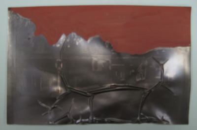
The negative is fairly damaged, and in the photo above, notice how the top layer is buckling. The shiny spots on the surface are called mirroring, which occurs when the emulsion layer of the negative oxidizes.
Also visible in this negative are some of the techniques photographers used to doctor their negatives to achieve certain results in the photographic print. There’s layer of “ruby red” opaque paint across the sky, which would have resulted in a perfectly crisp, clear white sky in the printed photograph. And the graphite markings on the buildings, along the tree line, and around the Texaco sign would have added definition to the printed photo.
I took the above photograph of the negative sitting on top of our lightbox so that you can see the effect the ruby red has – the sky is completely smooth and opaque where the product was painted on. The graphite markings were done to give the treeline a natural, feathered look – without them, the ruby red would have left unnatural straight lines there.
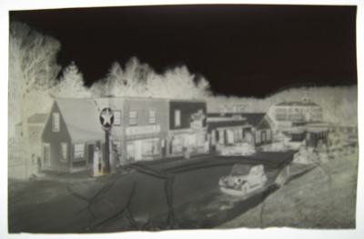
The negative was then photographically reproduced, resulting in the real photo card above. The clear sky and crisply outlined buildings make for a sharper, cleaner image of this downtown view of Highlands, NC.
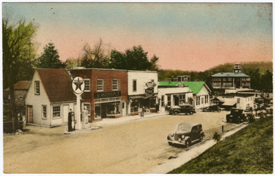
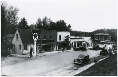
The above postcard was created from the same negative we’ve been discussing in this post. Here the image has been hand-colored after it was printed. The effect results in less detail when compared to the real photo card and to the negative, but it does add a certain panache.
A serendipitous reminder that postcards are an implement of commerce, not necessarily of history. Thanks for pulling back the curtain, Bridget.
As a summer renter in Highlands I was curious about the view. According to Randolph P. Shaffner’s “Heart of the Blue Ridge: Highlands, North Carolina” — at 737 pages, surely the world’s thickest local history per capita — the Texaco station at the top of 4th Street South dates to 1935. In 1947 Dr. Bill Matthews, the town’s first resident physician in 16 years, moved into the renovated building. Last time I noticed it was a health food store.
Thanks for sharing this image and the useful insight into how postcard photos were “photoshopped” long before there was Photoshop!
Alison Isenberg’s “Downtown America” (Chicago: Univ. of Chicago Press, 2004) has a fascinating chapter on the production of townscape postcards, many examples of which she drew from N.C. (she taught here in our history dept. for several years). She shows that postcard images of downtowns were sometimes more aspirational than realistic: sidewalks were added; streets paved; telephone wires removed.
This is awesome Bridgette, thanks for sharing! So neat to see the before-and-after.
Sorry, *Bridget 🙂